Case Study #1

Image courtesy of Lamar (Nov. 2, 2018). Found on Freedom For Targeted Individuals.
This is an example of bad information design because the typography is flat and boring. While there is certainly colour contrast between the black text and yellow background, the fact that all of the text is center aligned with the same font and font size does not make any chunk of text in the advertisement pop out. The three main blocks of text are interrupted by the windshield mirror (is it a mirror?) and the blue box of text, which makes it difficult to understand the meaning of the poster, until reading it a few times. Another issue I have with this design is the colour. Even though the use of the colour yellow is attention grabbing, it can also symbolize happiness and hope, which seems to be the exact opposite of the message of targeted internet stalking.
Case Study #2
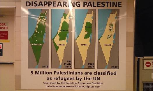
Image courtesy of Marcel Chaves (2013). Found on The Georgia Straight.
This infographic has many issues to do with colour and type. First, there are too many colours in the diagram. The blue and grey of the surrounding areas can be left out, as they are unimportant to Palestine/Israel. These colours also affect the contrast of the dark green and pale yellow. Perhaps colour with higher contrast may be used if the grey and blue must be used. Another issue with the this design is that there is no legend for the coloured diagrams, making it hard to outsiders to understand. The use of a legend no longer requires the labels, Palestine and Israel, on the maps, leading to a neater design. The timeline (years) could be placed outside the diagrams so that there is more contrast in the composition. The font chosen also looks like a default bold font. A different typeface should be chosen to differentiate between heading and body text or information.
Case Study #3
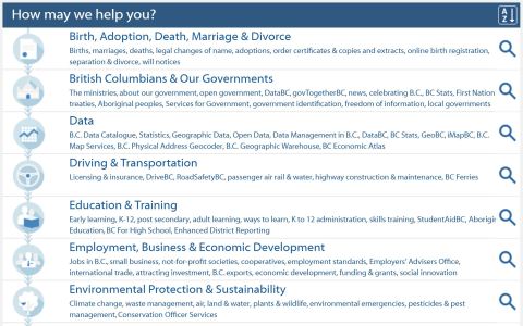
Found on The Government of British Columbia.
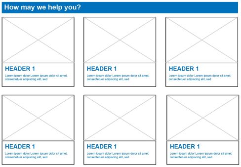
This navigational menu from the Government of British Columbia website is badly designed, as there is near to no hierarchy because every section is no space between each section. There is no grid system in place and so all sections looks very disorganized. While Canada is advertised as a culturally diverse country, this menu is very lacking to those who cannot understand English. The icons on the left are too small to be understood and the usability of this menu greatly depends on the alphabetically sorted headings of each section. Even as a native English speaker, this navigational menu is very text heavy and the flat type can be improved with a bolder typeface. Below is a quickly constructed layout that could be used with a bigger image or icon to aid those whose mother tongue is not English, while also improving the readability of the menu.
Case Study #4
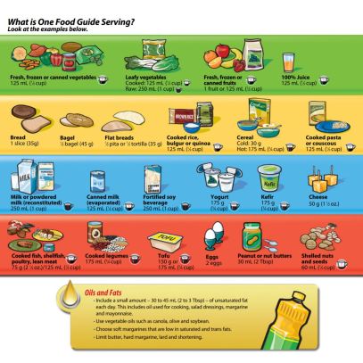
Information found on Canada Food Guide.
The Canada Food Guide information can be organized in a better way. Currently, the images and text seem very scattered across the page. There is the pattern of image on top, then text under, but the placement of images and text is very cramped in some areas. The size and location of the images is also inconsistent, with some pictures nearly touching the border of each block. The scattered placement of each group of items gives no whitespace and doesn’t let the infographic breathe, making it seem like an onslaught of information. To improve, I would suggest getting rid of the coloured backgrounds and instead, use coloured headers to separate the categories. It can also be improved by creating simpler icons and placing the text next to it, making it an overall neater design.
Case Study #5
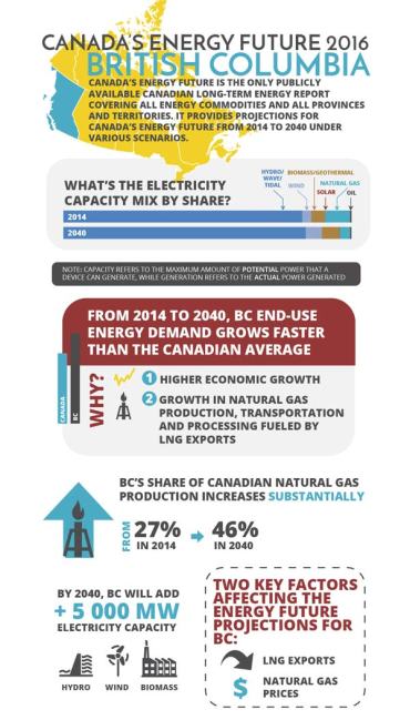
Found on Canada National Energy Board.
There is too much going on in this infographic from the Government of Canada website. While the information is organized neatly with a certain style, the red header in the middle conflicts with the yellow up on the top of the image. I think that the bright yellow is a bit too much, because it draws the audience’s attention away from BC, instead of towards it. I would choose a different colour, as only shades of red, blue, and grey are used in the rest of the poster. Another issue with this design is that every part of the poster is around the same size. There is no hierarchy. The red and yellow is attention grabbing, but everything else is the same size. It is difficult to skim and see the important parts that the poster is trying to convey.


