Case Study #1
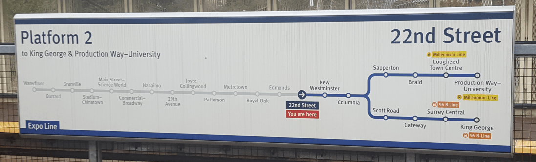
This Translink signage at 22nd Street station excels in the use of colour and contrast. The use of different colours along the map is used as a way-finding device, both literally and in the composition. The blue is used to aid in navigation along the Expo Line and the yellow and orange indicate a transfer to another transit network, such as the Millennium Line and 96 B-Line. The grey-scale stops preceding 22nd Street, with lower contrast, shows the stops that have already passed, which are less important than the ones coming up. The use of the bright red, paired with the small arrow allows commuters to quickly glance at the signage and know where they are heading. In addition, the scale of “22nd Street” and “Platform 2” also allows information to be communicated to commuters who may be visually impaired and require larger text to see.
Case Study #2

This brochure from FlyOver Canada uses good hierarchy and organization in information design. The red highlights important information, like discounts, location, and ratings, that they want to use to attract tourist. This three page brochure also uses a good choice of typography and text weight and scale, as it’s easy to scan for information. Headers with a heavier typeface provides the audience with a way-finding device, allowing them to quickly skip to sections which they find more important. The content below these headers are also neatly organized as they are further divided into sections.The icons used is also suggest to tourist that this attraction is more nature based, paired with the the photo in the background. Many times when a scenic photo is used, there may be lighter spots in the photo composition, but the photo is still dark enough that there is enough contrast for the text to pop out.
Case Study #3
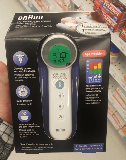
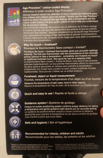
This packaging for a thermometer from Braun mostly consists of icons and text to convey information. The company has the challenge of using both English and French on the packaging, as it is being sold in Canada. However, since English is more widely spoken in Vancouver, the English content is in white with higher contrast with the black background, compared to the French text in grey. As users are more likely to glance at illustrations and headers, Braun chose to use pictographs which allow the communication of information from product to end-user, even if they are not fluent in English. Braun also chose to limit the usage of colour, as mainly indigo is used for the pictograms, with the exception of the temperature graph; red for unsafe temperatures, yellow for borderline, and green for healthy, which are universally known colours. Additionally, the headers are bolded, making it easier to scan for information, and extra information is place below in a larger chunk of text.
Case Study #4
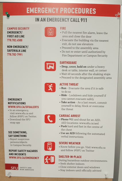
This poster is a part of SFU’s new emergency procedure, which uses icons and red to highlight important information. The icons show the first thing that students and faculty should do in case of an emergency, even without reading the full instructions. In red, is also important information that people should note down, such as contact information and the categories of emergencies. The typeface chosen for headers is easy to quickly read when in emergencies. With similar characteristics to DIN, it is often used for display and traffic signage in Europe, which makes it an excellent choice to used in a poster such as this one. A grid system is also created, separating the procedures from the security information, giving the composition a neat and organized look.
Case Study #5
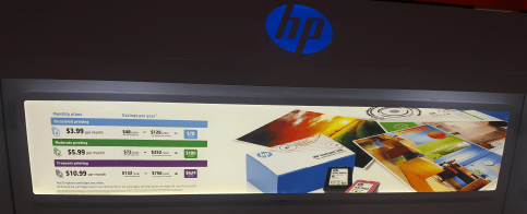
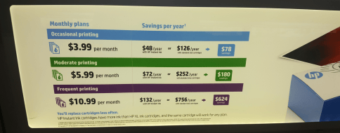
This advertisement was found at Best Buy’s printer and cartridge section. It uses colour, scale and weight, and repetition and proximity in its composition. The colour differentiates between prices and levels based on usage. The savings are posted with a coloured background, attracting more customer attention. The three price points also uses a very similar layout to each other, allowing customers to easily compare between each section. The bolded text sticks out at the audience, showing only a few dollar per month, but the fine print with terms and conditions may not be noticeable at all.


