International Airport Signage
Below is three different brandings of signage at international airports around the world, including Vancouver’s YVR airport, Los Angeles’ LAX, and Hong Kong International Airport (HKG). As these airports see thousands of international visitors everyday, these signs act as a wayfinding device for these visitors.
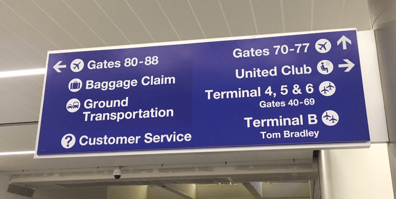
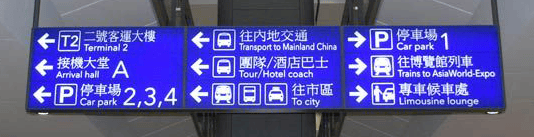
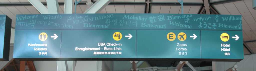
From chapter 2 of Introduction to Information Design, Coates and Ellison notes that “when designing for an international audience, simplicity and clarity are the qualities to keep in mind. If there are fewer elements to distract, the message will be more efficiently delivered. (pg 54)” It must efficiently convey information by using imagery along with a limited amount of text. All these signage use small icons and arrow to help visitors navigate the airport. By organizing the information according to the directions of the areas, it decreases the user’s cognitive load, making it faster and easier for them to find their way around the airport.
Visitor demographic also plays a part in the airport branding, in regards to the typeface and languages chosen for each sign. Whereas the icons can be used by all international visitors, each typeface is chosen to target a specific demographic in each airport. In LAX’s branding, a bold humanist font is chosen, as the majority of visitors is English-speaking and will rely on text rather than icons. In HKG’s branding, the majority of passer-bys are Chinese, therefore, Chinese characters are larger and more significant, compared to the English text that is placed underneath for English-speaking visitors. YVR’s branding is more neutral compared to the previous two examples, as Canada prides itself as a multicultural country. It uses three different languages, all in similar weight and style. Thus, each designer for each airport has made type considerations for the audience and user of each sign.
My Sketch
This sketch was inspired by the screenshot next to it. I like how each section is separated by switching between full bleed layouts and grid structures. I believe this allows for more freedom and variety between each section of information I want to layout in the final website.


Hello, Sun
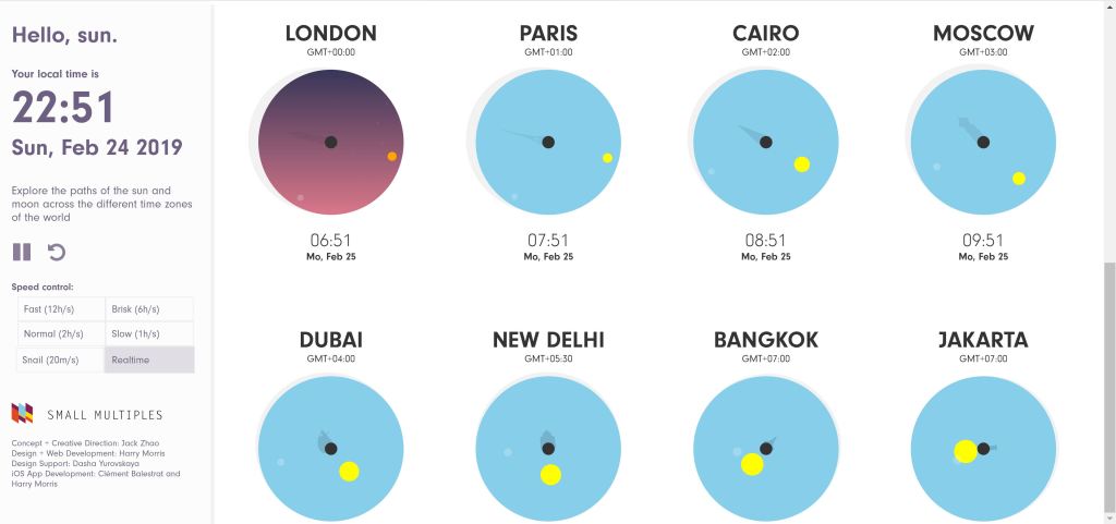
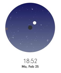
Hello, Sun, a data visualization website that illustrates the sun and moon’s rotation around Earth. Instead of bombarding the users with large amounts of information, this website breaks down the Earth’s rotational information into graphics and visuals which makes it easier for the user to understand. Quoting the Information Design Workbook, infographics are used to “clarify [something] and not dumbing [it] down. (pg. 156)” Hello, Sun compresses the information into a website that is easily navigational, with a simple toolbar on the side to control the rate of rotation. It also uses a colour palette with large contrast to differentiate between night and day, as well as the sun and moon, when both are visible.
GettyImages Infographic
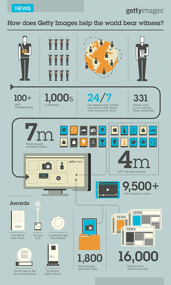
This infographic advertises gettyimages, a stock photo company, by showing daily statistics of the company. It uses graphics to aid readers navigate through the image. The main bold line with arrowheads leads the user’s eye through the information. The fainter arrows and lines separate the less important information from the rest. The lines also lay down a grid, which is flexible throughout the design and organizes the information, but still leaving the composition dynamic.


