Idea Journal 4

On the right are the new bus stop sign layouts. Compared to the older designs on the left (Buzzer), they contain the same information, but the details are laid out consistently. The older signs each have slightly different layouts, unlike the newer ones which have one distinct design throughout all of Metro Vancouver. In the Introduction to Information Design reading, it states that the New York City wayfinding system used “a symbol that […] should be instantly recognizable, iconic and memorable.” Translink’s new branding includs the usage of the “T” symbol, which can be seen at almost all transit stations across their network. It also includes isotypes, like the bus and handicap symbol, communicating information universally to a wider audience.

Comparing both of these transit service map legends show the efficient and inefficient usage of colour. While colour is most definitely one of the more powerful tools there are in information design, a colour palette must be chosen carefully for the desired outcome. On the left is a legend for various bus lines at Surrey Central Station. It uses filled, unfilled, and navy bus route numbers to differentiate between full, limited, and night service. While this may seem to be a good idea at first, using colours with high contrast to show different lines, the Information Design Workbook states that the audience usually cannot recall more than seven colours. The sign on the left uses too many colours (there is a portion of the list not photographed) for commuters to find on the map.

On the other hand, the index on the right uses a high contrast, limited colour palette. Using a limited choice of colours help commuters navigate the large map much easier than using a large variety of colours, which can be confusing when viewed in a large context. It also uses a navy blue colour palette in the headers to stick to Translink’s branding.
20190320_144534

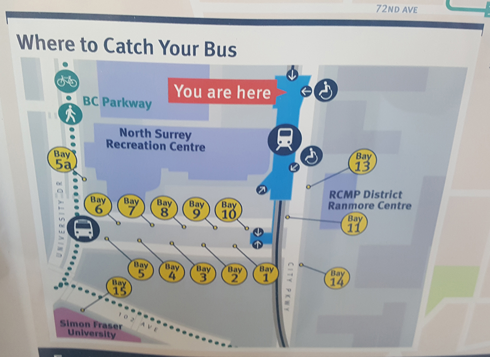
The Introduction to Information Design reading covers three stages of a journey: planning, moving, and changing. Paired with the information from the map and legend (above), it provides different options for commuters to plan a trip on the Translink network and allows them to choose routes that are more efficient. This graphic also provides information on recognizable landmarks and buildings that are significant in the area, helping them navigate the station and find their ultimate destination. As Surrey Central is a transit hub that thousands of people visit daily, it allows transfers between different modes of transportation. This photo shows bus stops, Skytrain, and pathways for travellers to change between types of transportation, an important characteristic for a wayfinding devive.
Idea Journal Submission 3

International Airport Signage

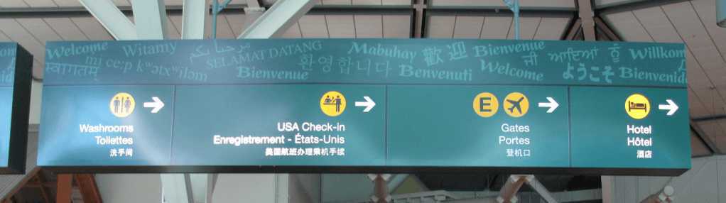
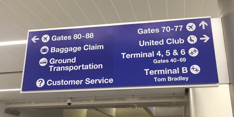
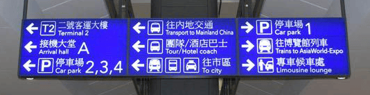
Below is three different brandings of signage at international airports around the world, including Vancouver’s YVR airport, Los Angeles’ LAX, and Hong Kong International Airport (HKG). As these airports see thousands of international visitors everyday, these signs act as a wayfinding device for these visitors.

lax 1
LAX Signage
hk airport2
HKG Signage
yvr airport3
YVR Signage

From chapter 2 of Introduction to Information Design, Coates and Ellison notes that “when designing for an international audience, simplicity and clarity are the qualities to keep in mind. If there are fewer elements to distract, the message will be more efficiently delivered. (pg 54)” It must efficiently convey information by using imagery along with a limited amount of text. All these signage use small icons and arrow to help visitors navigate the airport. By organizing the information according to the directions of the areas, it decreases the user’s cognitive load, making it faster and easier for them to find their way around the airport.

Visitor demographic also plays a part in the airport branding, in regards to the typeface and languages chosen for each sign. Whereas the icons can be used by all international visitors, each typeface is chosen to target a specific demographic in each airport. In LAX’s branding, a bold humanist font is chosen, as the majority of visitors is English-speaking and will rely on text rather than icons. In HKG’s branding, the majority of passer-bys are Chinese, therefore, Chinese characters are larger and more significant, compared to the English text that is placed underneath for English-speaking visitors. YVR’s branding is more neutral compared to the previous two examples, as Canada prides itself as a multicultural country. It uses three different languages, all in similar weight and style. Thus, each designer for each airport has made type considerations for the audience and user of each sign.

My Sketch

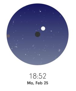
This sketch was inspired by the screenshot next to it. I like how each section is separated by switching between full bleed layouts and grid structures. I believe this allows for more freedom and variety between each section of information I want to layout in the final website.

Hello, Sun

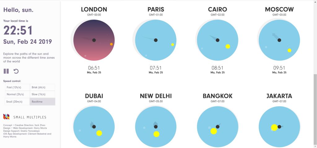
Hello, Sun, a data visualization website that illustrates the sun and moon’s rotation around Earth. Instead of bombarding the users with large amounts of information, this website breaks down the Earth’s rotational information into graphics and visuals which makes it easier for the user to understand. Quoting the Information Design Workbook, infographics are used to “clarify [something] and not dumbing [it] down. (pg. 156)” Hello, Sun compresses the information into a website that is easily navigational, with a simple toolbar on the side to control the rate of rotation. It also uses a colour palette with large contrast to differentiate between night and day, as well as the sun and moon, when both are visible.

SunCapture

GettyImages Infographic

getty
GettyImages

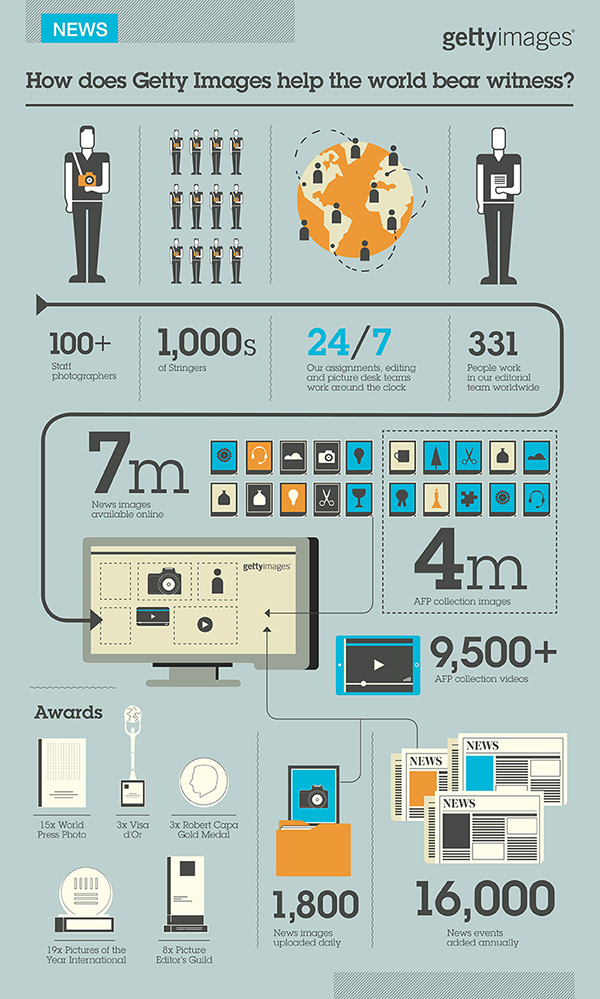
This infographic advertises gettyimages, a stock photo company, by showing daily statistics of the company. It uses graphics to aid readers navigate through the image. The main bold line with arrowheads leads the user’s eye through the information. The fainter arrows and lines separate the less important information from the rest. The lines also lay down a grid, which is flexible throughout the design and organizes the information, but still leaving the composition dynamic.


Idea Journal Submission 2

Case Study #1

Translink.png

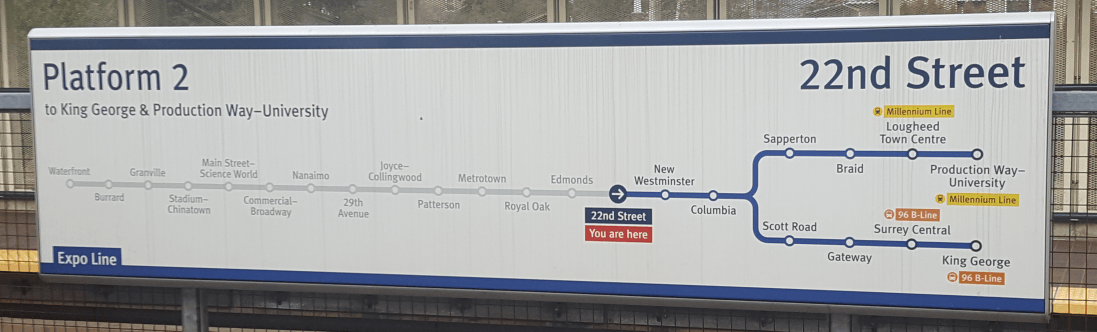
This Translink signage at 22nd Street station excels in the use of colour and contrast. The use of different colours along the map is used as a way-finding device, both literally and in the composition. The blue is used to aid in navigation along the Expo Line and the yellow and orange indicate a transfer to another transit network, such as the Millennium Line and 96 B-Line. The grey-scale stops preceding 22nd Street, with lower contrast, shows the stops that have already passed, which are less important than the ones coming up. The use of the bright red, paired with the small arrow allows commuters to quickly glance at the signage and know where they are heading. In addition, the scale of “22nd Street” and “Platform 2” also allows information to be communicated to commuters who may be visually impaired and require larger text to see.

Case Study #2

FlyOverCanada

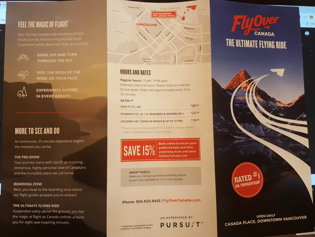
This brochure from FlyOver Canada uses good hierarchy and organization in information design. The red highlights important information, like discounts, location, and ratings, that they want to use to attract tourist. This three page brochure also uses a good choice of typography and text weight and scale, as it’s easy to scan for information. Headers with a heavier typeface provides the audience with a way-finding device, allowing them to quickly skip to sections which they find more important. The content below these headers are also neatly organized as they are further divided into sections.The icons used is also suggest to tourist that this attraction is more nature based, paired with the the photo in the background. Many times when a scenic photo is used, there may be lighter spots in the photo composition, but the photo is still dark enough that there is enough contrast for the text to pop out.

Case Study #3

Thermometer1

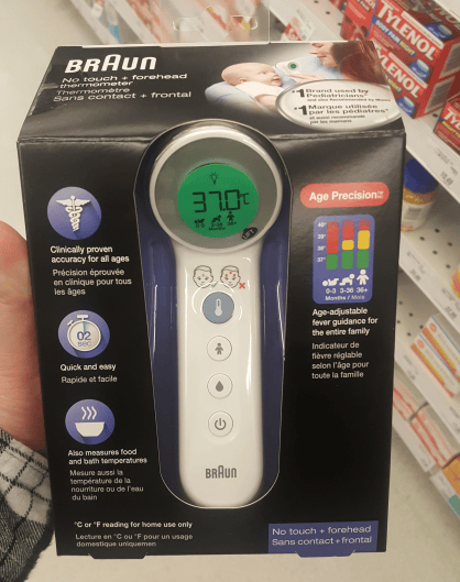
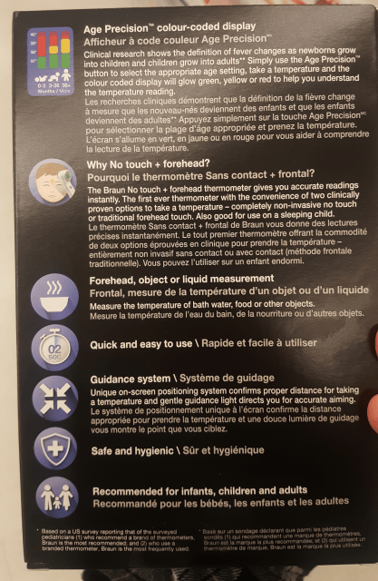
This packaging for a thermometer from Braun mostly consists of icons and text to convey information. The company has the challenge of using both English and French on the packaging, as it is being sold in Canada. However, since English is more widely spoken in Vancouver, the English content is in white with higher contrast with the black background, compared to the French text in grey. As users are more likely to glance at illustrations and headers, Braun chose to use pictographs which allow the communication of information from product to end-user, even if they are not fluent in English. Braun also chose to limit the usage of colour, as mainly indigo is used for the pictograms, with the exception of the temperature graph; red for unsafe temperatures, yellow for borderline, and green for healthy, which are universally known colours. Additionally, the headers are bolded, making it easier to scan for information, and extra information is place below in a larger chunk of text.

Thermometer2

Case Study #4

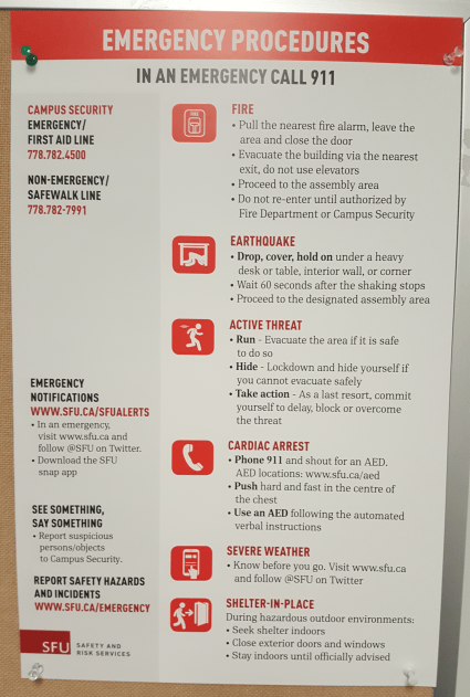
SFU Emergency

This poster is a part of SFU’s new emergency procedure, which uses icons and red to highlight important information. The icons show the first thing that students and faculty should do in case of an emergency, even without reading the full instructions. In red, is also important information that people should note down, such as contact information and the categories of emergencies. The typeface chosen for headers is easy to quickly read when in emergencies. With similar characteristics to DIN, it is often used for display and traffic signage in Europe, which makes it an excellent choice to used in a poster such as this one. A grid system is also created, separating the procedures from the security information, giving the composition a neat and organized look.

Case Study #5

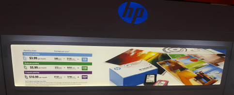
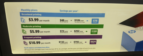
HP1HP2

This advertisement was found at Best Buy’s printer and cartridge section. It uses colour, scale and weight, and repetition and proximity in its composition. The colour differentiates between prices and levels based on usage. The savings are posted with a coloured background, attracting more customer attention. The three price points also uses a very similar layout to each other, allowing customers to easily compare between each section. The bolded text sticks out at the audience, showing only a few dollar per month, but the fine print with terms and conditions may not be noticeable at all.

Idea Journal Submission 1

Case Study #1

image1

Image courtesy of Lamar (Nov. 2, 2018). Found on Freedom For Targeted Individuals.

This is an example of bad information design because the typography is flat and boring. While there is certainly colour contrast between the black text and yellow background, the fact that all of the text is center aligned with the same font and font size does not make any chunk of text in the advertisement pop out. The three main blocks of text are interrupted by the windshield mirror (is it a mirror?) and the blue box of text, which makes it difficult to understand the meaning of the poster, until reading it a few times. Another issue I have with this design is the colour. Even though the use of the colour yellow is attention grabbing, it can also symbolize happiness and hope, which seems to be the exact opposite of the message of targeted internet stalking.

Case Study #2

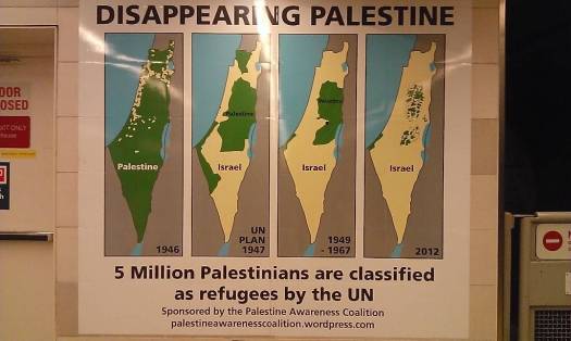
image2

Image courtesy of Marcel Chaves (2013). Found on The Georgia Straight.

This infographic has many issues to do with colour and type. First, there are too many colours in the diagram. The blue and grey of the surrounding areas can be left out, as they are unimportant to Palestine/Israel. These colours also affect the contrast of the dark green and pale yellow. Perhaps colour with higher contrast may be used if the grey and blue must be used. Another issue with the this design is that there is no legend for the coloured diagrams, making it hard to outsiders to understand. The use of a legend no longer requires the labels, Palestine and Israel, on the maps, leading to a neater design. The timeline (years) could be placed outside the diagrams so that there is more contrast in the composition. The font chosen also looks like a default bold font. A different typeface should be chosen to differentiate between heading and body text or information.

Case Study #3

image3

Found on The Government of British Columbia.

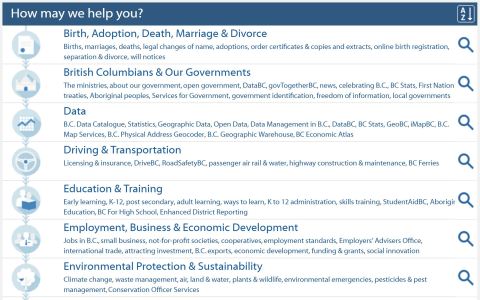
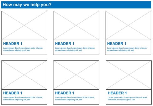
This navigational menu from the Government of British Columbia website is badly designed, as there is near to no hierarchy because every section is no space between each section. There is no grid system in place and so all sections looks very disorganized. While Canada is advertised as a culturally diverse country, this menu is very lacking to those who cannot understand English. The icons on the left are too small to be understood and the usability of this menu greatly depends on the alphabetically sorted headings of each section. Even as a native English speaker, this navigational menu is very text heavy and the flat type can be improved with a bolder typeface. Below is a quickly constructed layout that could be used with a bigger image or icon to aid those whose mother tongue is not English, while also improving the readability of the menu.

image3b

Case Study #4

image4

Information found on Canada Food Guide.

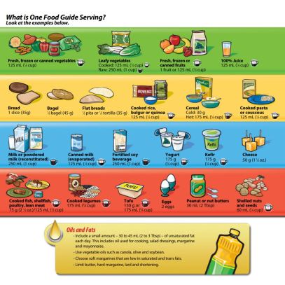
The Canada Food Guide information can be organized in a better way. Currently, the images and text seem very scattered across the page. There is the pattern of image on top, then text under, but the placement of images and text is very cramped in some areas. The size and location of the images is also inconsistent, with some pictures nearly touching the border of each block. The scattered placement of each group of items gives no whitespace and doesn’t let the infographic breathe, making it seem like an onslaught of information. To improve, I would suggest getting rid of the coloured backgrounds and instead, use coloured headers to separate the categories. It can also be improved by creating simpler icons and placing the text next to it, making it an overall neater design.

Case Study #5

image5

Found on Canada National Energy Board.

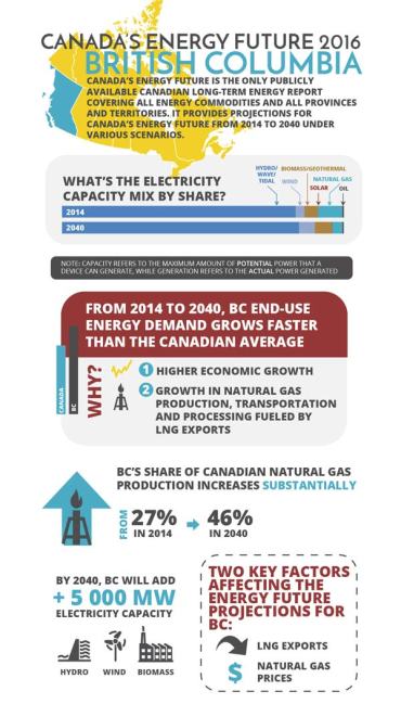
There is too much going on in this infographic from the Government of Canada website. While the information is organized neatly with a certain style, the red header in the middle conflicts with the yellow up on the top of the image. I think that the bright yellow is a bit too much, because it draws the audience’s attention away from BC, instead of towards it. I would choose a different colour, as only shades of red, blue, and grey are used in the rest of the poster. Another issue with this design is that every part of the poster is around the same size. There is no hierarchy.  The red and yellow is attention grabbing, but everything else is the same size. It is difficult to skim and see the important parts that the poster is trying to convey.